+40% Efficiency in Industrial Assessments
Designing a Seamless B2B Platform for Smarter Industrial Assessments
Project: Manufacturing Assessments Platform for Vessel Scale
Type: Web Application (B2B SaaS)
Role: UX/UI Designer
Tools
- Figma
- FigJam
- Dovetail
- Jira
- Voiceflow for Chatbot
- Vix Studio for public website
- CapCut for video edition
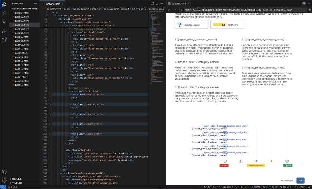
- HTML/CSS (for PDF report generation)
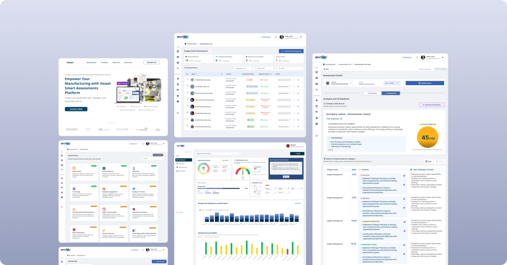
Deliverables: Dashboard redesign, Assessment flow, Intake form, Report builder, Public website redesign (vesselscale.com)
1. Summary:
I redesigned a digital assessment platform for manufacturing advisors that automates evaluations, visualizes resilience metrics, and generates intelligent reports. The new design streamlined navigation, reduced data entry errors, and simplified the overall workflow — making it easier for both public Manufacturing Extension Partnerships (MEPs) and private consultants to manage assessments nationwide.
Result:
After launch, advisors reported saving up to 40% of the time per assessment and expanding their client reach beyond their local region.
Additionally, usability testing revealed a 35% faster learning curve, allowing senior advisors (ages 45+) to confidently navigate the new interface after just one session — a significant improvement from the previous version, which required multiple training sessions.
2. Problem Statement & Context
Manufacturing Extension Partnerships (MEPs) and private industrial consultants evaluate companies’ operations to improve efficiency, resilience, and supply chain performance. However, most assessments were conducted manually or in fragmented spreadsheets, making it hard to visualize results or standardize feedback.
Problems Identified:
- Time-consuming assessment processes
- Inconsistent data collection and scoring
- Lack of dashboards for aggregated insights
- Difficulties in generating professional client reports
Business Goal:
Create a centralized, digital tool for assessments, enabling advisors to collect data, analyze results, and generate automated reports — all in one secure platform.
Design Challenge (HMW):
“How might we help manufacturing advisors perform and manage assessments faster, while delivering clearer insights to their clients?”
3. Research Phase
Methods:
- 5 stakeholder interviews (advisors & MEP directors)
- 3 user walkthroughs of the old platform
- Competitor analysis
Key Insights:
- Advisors work with multiple companies simultaneously.
- They need flexible link generation (one-to-one or one-to-many).
- The reporting phase is their biggest pain point — formatting PDFs manually took hours.
- Many clients are non-technical, so interfaces must be intuitive and trustworthy.
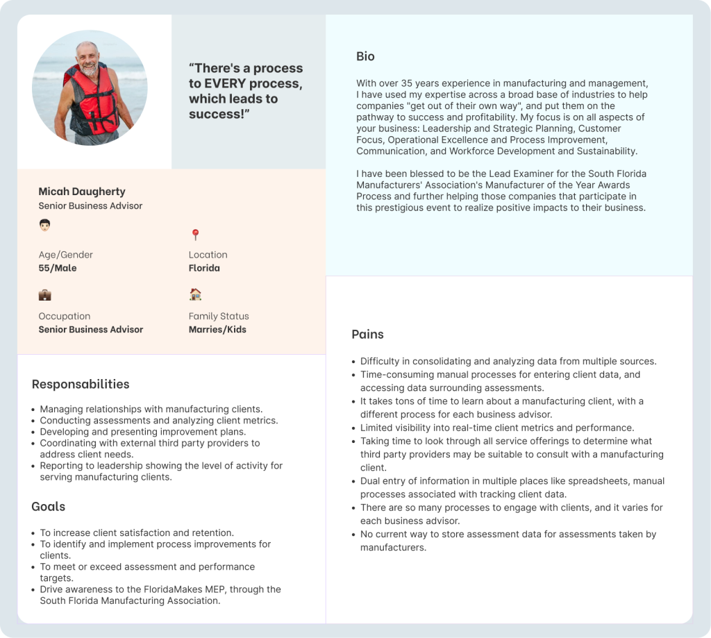
Personas:
Journey Map
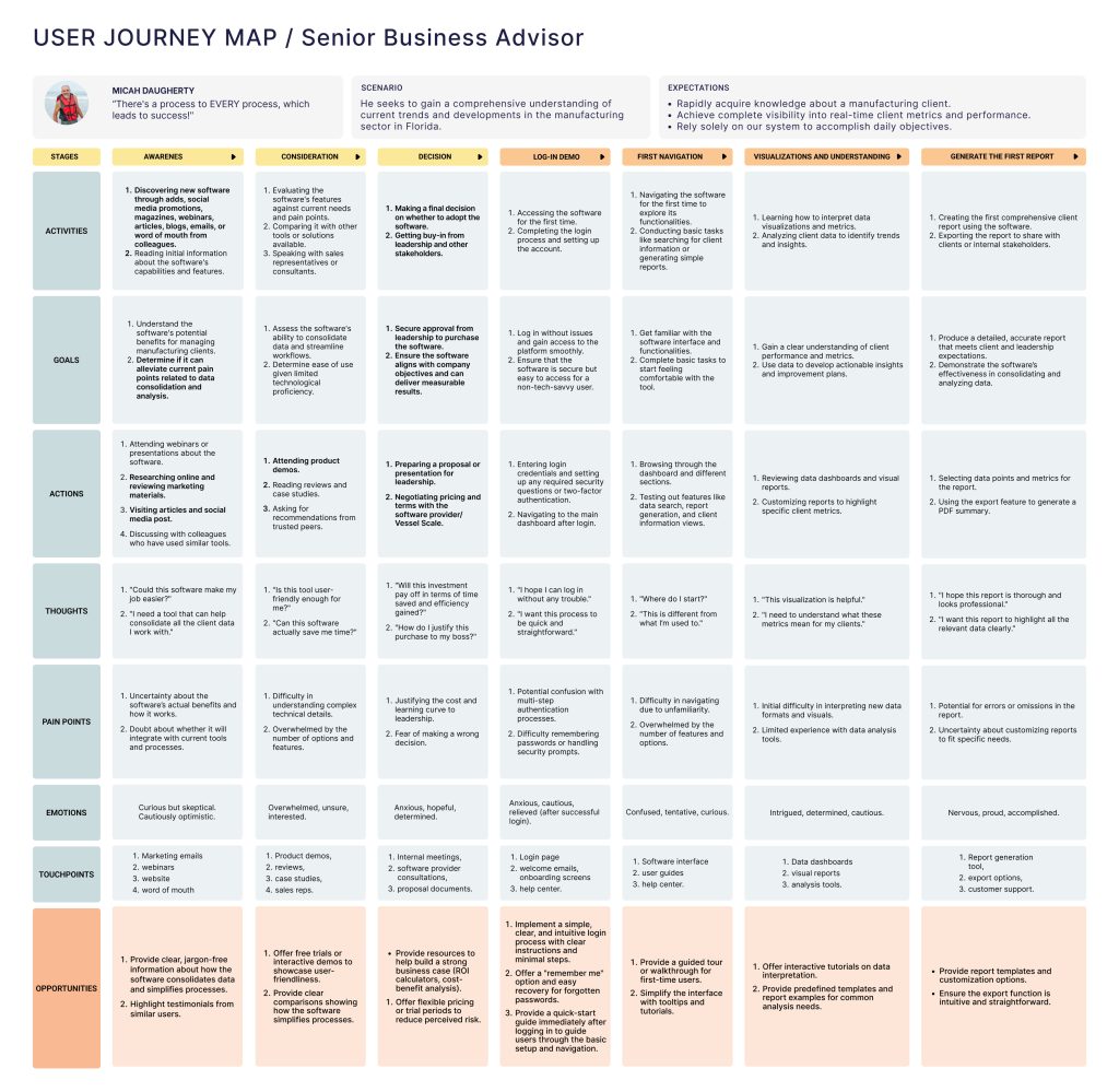
My background in communication and marketing allowed me to design a comprehensive User Journey Map that captures diverse user perspectives, outlines key interaction steps, and identifies pain points and opportunities for improvement.
4. Define Phase
Key Problems:
- Data overload and lack of visualization
- Manual PDF or spreadsheets creation
- Poor user experience during form filling
- Inconsistent performance across clients
User Goals:
- Quickly launch assessments and track completion
- Get visual summaries of results
- Send professional, branded reports
Business Goals:
- Scale platform to serve both public (MEP Center) and private consultants
- Improve efficiency and perceived value
5. Ideation Phase
Exploration:
I sketched out various layouts for the dashboard, experimenting with KPI visualization styles, link creation flows, and company management modules.
Architecture Decisions:
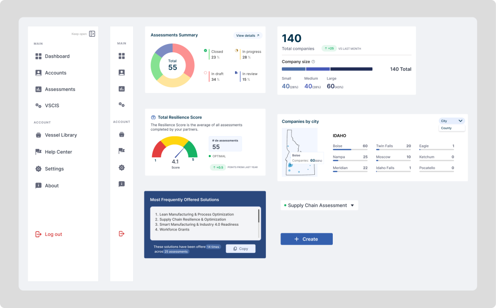
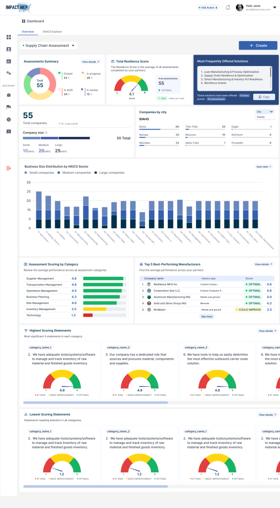
- Side navigation for consistent access to modules (Dashboard, Accounts, Assessments, Ecosystem)
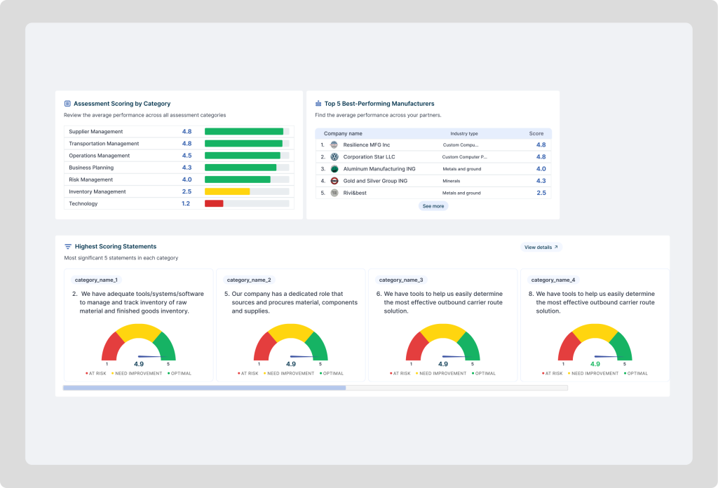
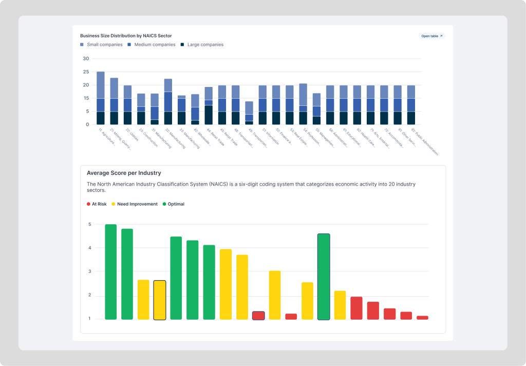
- Data visualizations (pie + bar charts) to display key metrics: total assessments, resilience score, company size, and regional distribution
- CTA structure: “+ Create” for assessment creation at the top level
Key Choice:
Adopted modular cards to make it scalable for new assessments or analytics features.
6. Design Phase
Highlights:
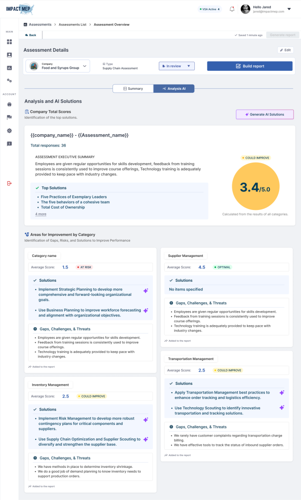
- Clean dashboard with overview metrics (Assessments Summary, Resilience Score, Top Solutions)
- Visuals by city and company size distribution
- Detailed company profiles with demographic and performance data
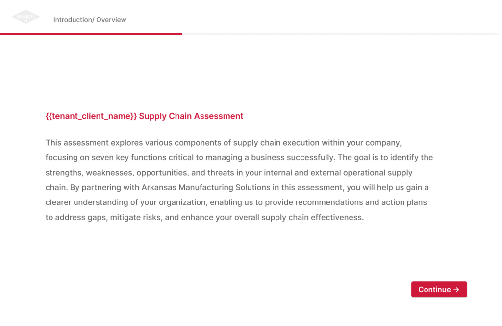
- Simplified intake form for manufacturers (multi-section, auto-save link feature)
- HTML/CSS-based PDF report builder for consistent output and branding.
7. Prototype & Testing Phase
Prototypes in Figma:
- Tested navigation clarity and information grouping.
- Simulated dashboard interactions and assessment review flow.
User Testing:
- 4 advisors participated in moderated sessions.
Question:
- “How easy was it to complete this task?” (1 = very difficult, 7 = very easy)
- Result: Average score: 6.3 / 7
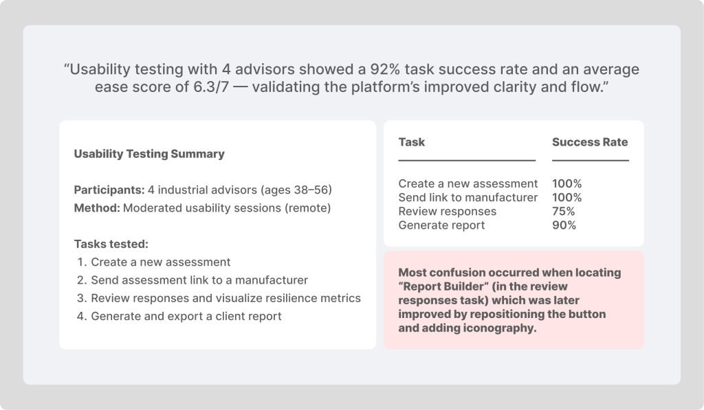
Feedback:
- Users loved the simplicity of generating company-specific links.
- Suggested showing progress states (“In review”, “In progress”, “Closed”).
- Requested visibility of average scores per company.
Iterations:
✅ Added assessment status segmentation in pie chart
✅ Enhanced summary widgets with % progress
✅ Introduced “Most Frequently Offered Solutions” panel
✅ UX Writing from “Report Builder” to “Build Report” and increasing the size of the button
8. Final Solution
The redesigned VesselScale platform empowers manufacturing advisors with:
- Centralized Dashboard showing assessment health, resilience trends, and company segmentation.
- Assessment Management where advisors can review results, analyze data, and generate reports.
- Manufacturer Intake Form with smooth UX and clear progress tracking.
- Automated Report Generation via HTML/CSS templates for download and sharing.
- Website Redesign (vesselscale.com) communicating value propositions, features, and use cases for both MEPs and private consultants.
9. Impact & Learnings
Impact:
- Advisors save ~40% of time per assessment.
- Platform expanded from 5 to 12 MEP centers in pilot phase.
- Private consultants nationwide began adopting the tool.
Feedback:
“Now I can serve clients in other states without flying there. Everything is digital.” — Private Advisor
Learnings:
- The simplicity of data visualization matters more than visual complexity.
- Integrating reporting automation created unexpected business value.
Next Steps:
- Add predictive analytics and AI-assisted recommendations.
10. AI Feature (updated)
I designed the concept for an AI-powered analytics assistant that interprets assessment results and suggests actionable improvement strategies. The system automatically detects low-scoring areas (e.g., Supply Chain Resilience, Workforce Readiness) and generates tailored recommendations directly within the report.
Beyond insights, it also builds a dynamic “action plan” for consultants or advisors, linking each recommendation to the corresponding service package offered by their organization.
Example:
- For Clients (in the Report):
“Your lowest score is in Supply Chain Agility (1.9). Consider implementing local sourcing partnerships or quarterly review cycles.”
For Consultants:
“To improve Supply Chain Agility for Company 1, the most effective intervention is Service Package 2, which directly addresses supplier diversification and workflow optimization.”