Redefining the First-Time Experience for Cybersecurity Platform
PROBLEM
During product demonstrations, leads and decision-makers often felt confused or disconnected from what they were seeing:
• The dashboard lacked visual hierarchy, all data looked equally important.
• Dense technical terminology and tables caused information overload.
• The interface felt cold and analytical, failing to guide attention.
• Sales teams struggled to communicate value efficiently.
This limited understanding during demos led to hesitation in adoption and reduced conversion opportunities.
Stakeholder Insights
Based on internal stakeholder interviews (see Onboarding UX/UI – Stakeholder Questions), four main audience segments were identified:
Audience Type | Key Need |
|---|---|
Managed Security Providers | Multi-tenant visibility and client reporting |
SOC-Level Enterprises | Understanding which controls are most effective |
Small Businesses | Guidance to identify and mitigate vulnerabilities |
Cyber Insurance Providers | Risk data to assess and price coverage |
The platform needed to speak to both CISOs and analysts, balancing technical depth with clarity for executive audiences.
Design Goals
1. Create a visually guided experience with clear data hierarchy and focus areas.
2. Simplify complex cybersecurity metrics through color, layout, and visual storytelling.
3. Build trust and engagement through a modern, structured interface.
4. Support sales and demo presentations by making the platform self-explanatory.
5. Establish a cohesive design language conveying expertise and accessibility.
Process
1. Audit & Analysis
I began by reviewing existing dashboards and mapping how demo viewers interacted with the platform. I found that many didn’t understand where to look first or what the charts represented.
2. Information Architecture
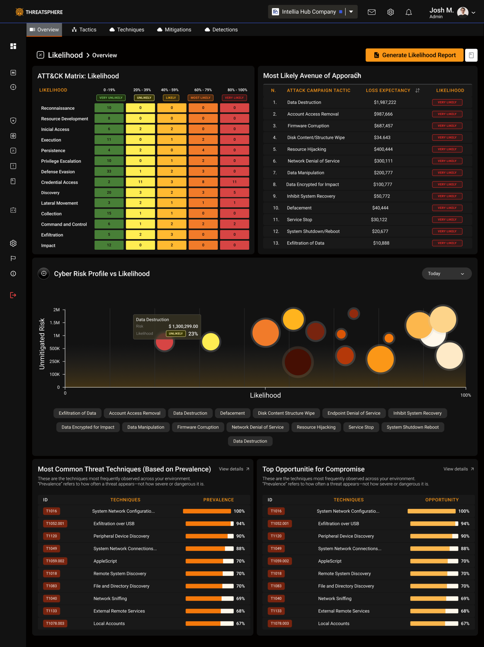
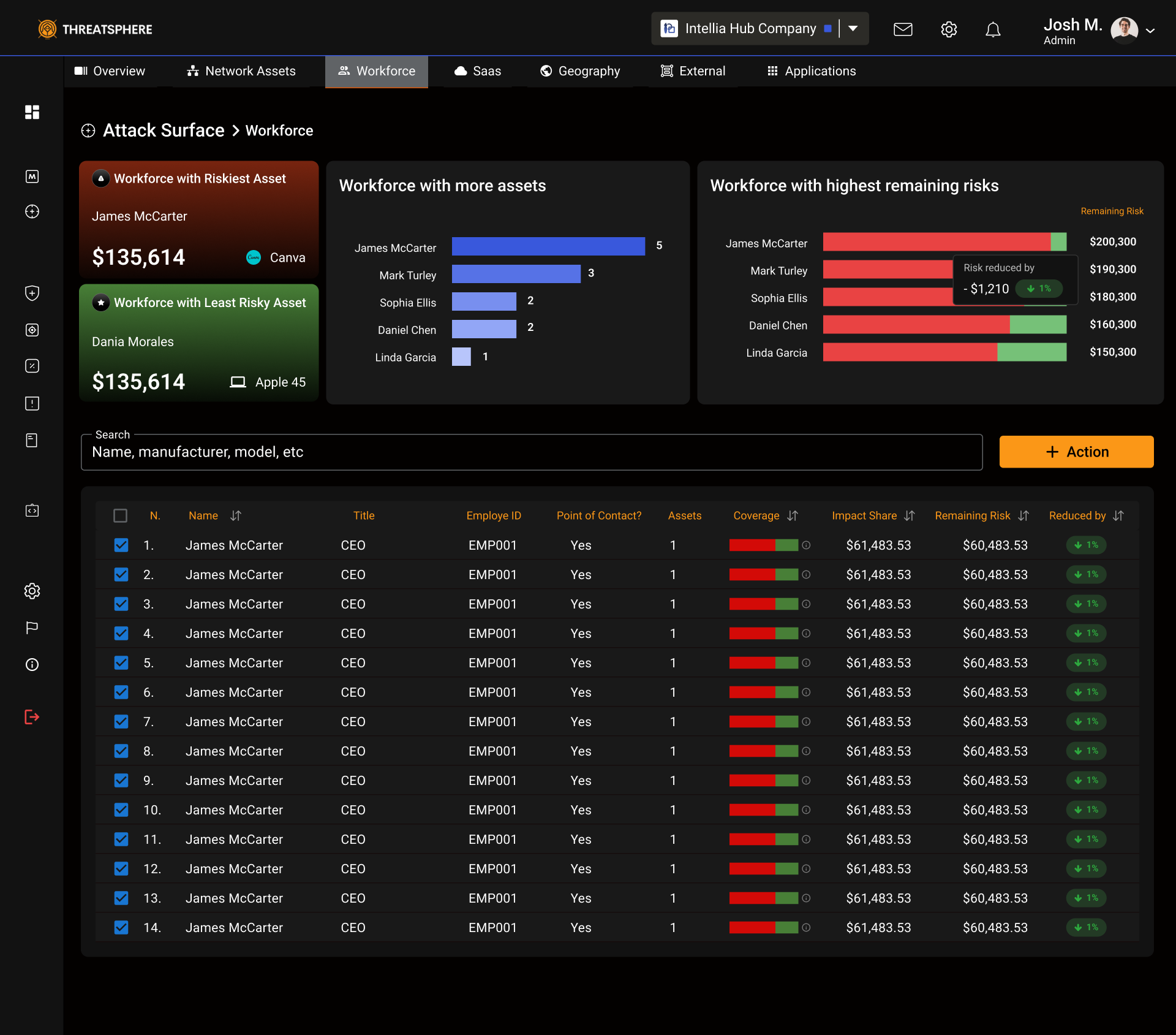
Reorganized navigation and dashboard groupings into meaningful sections:
Threats – ATT&CK Matrix, Attack Surface
Risk Management – Likelihood, Impacts, Reports
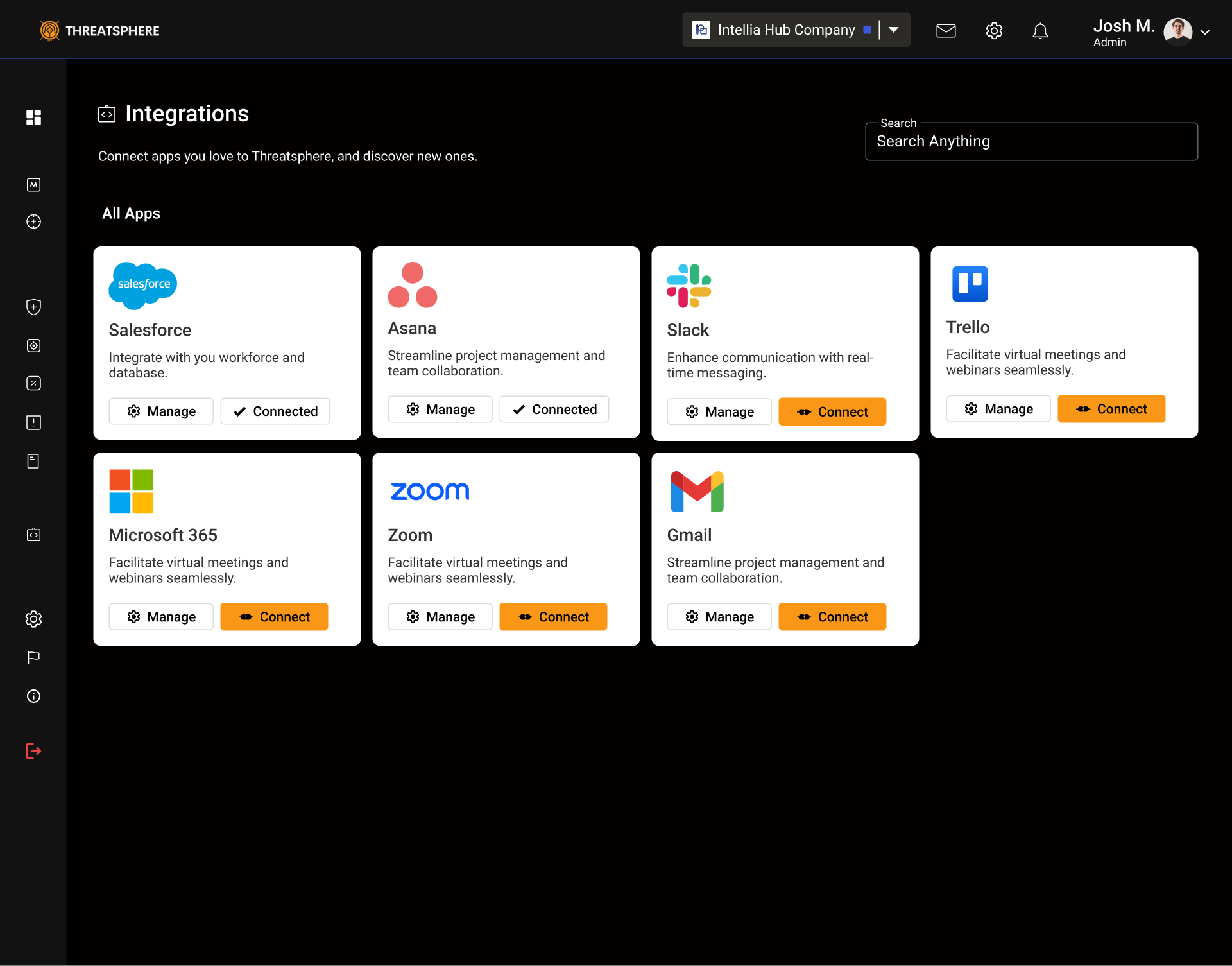
Connections – Workforce, Assets, Integrations
This helped create a top-down flow from strategic to tactical insights.
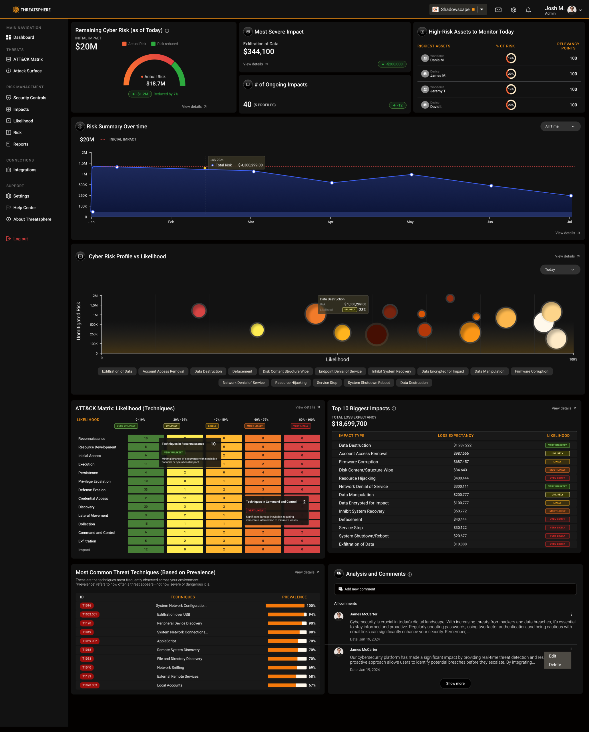
3. Visual Hierarchy
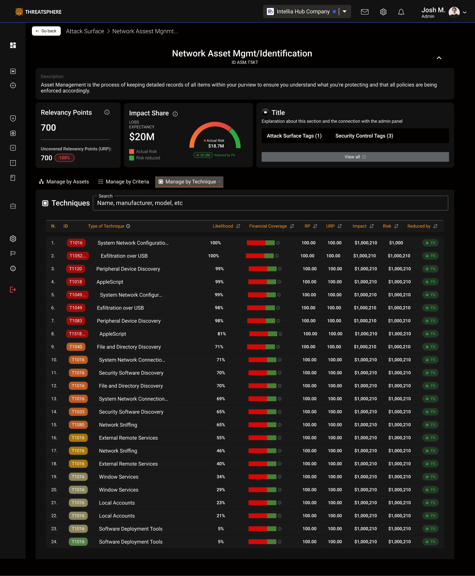
Introduced a layered information system:
High-level KPIs → Risk score, total controls, coverage
Mid-level visualizations → Impact vs. likelihood charts
Detailed data tables → Controls and assets by severity
Used color semantics (green–yellow–red) to reflect risk levels and guide visual attention.
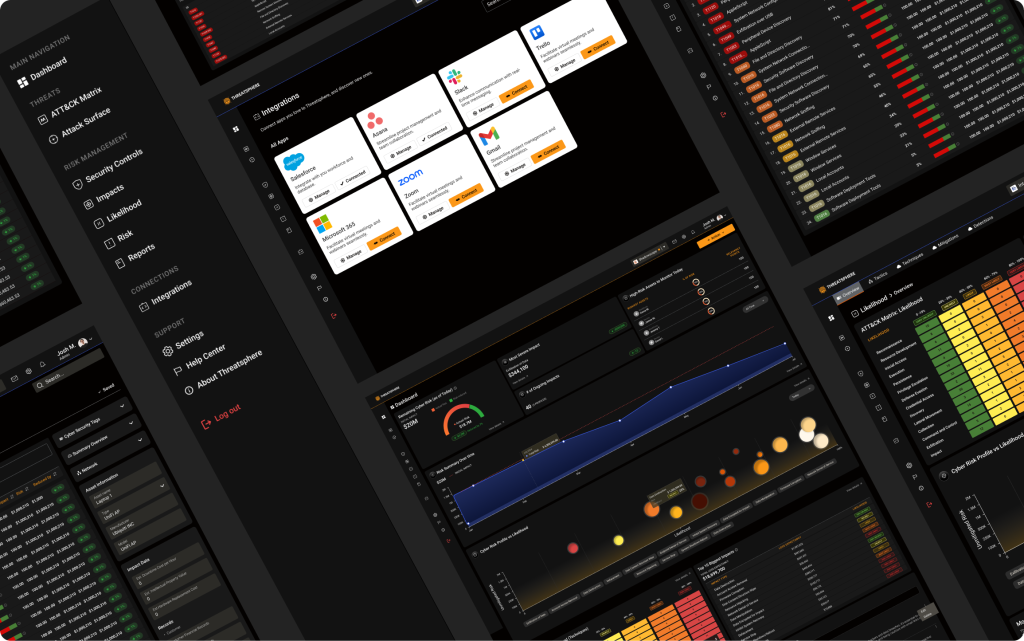
4. UI Redesign
Simplified interface components and spacing for readability
Added contextual tooltips for complex cybersecurity terms
Enhanced typography to separate executive summaries from technical details
Introduced dark theme to improve focus and reduce fatigue
Built modular cards and widgets for flexible reporting views
Key Improvements
Before | After |
|---|---|
Dense tables with equal visual weight | Layered hierarchy with bold KPIs and structured charts |
Heavy technical text | Short labels, color cues, and contextual explanations |
Cold, data-only design | Engaging visuals aligned with ATT&CK Matrix standards |
Hard to demo | Visually narrative dashboards that support sales storytelling |
After usability reviews and internal demo testing:
Sales teams reported a 60% improvement in demo flow and storytelling clarity.
Leads described the interface as “much clearer and intuitive.”
Sales teams feel more confident in their demo sessions.
Product perceived as more trustworthy, professional, and ready for enterprise use.
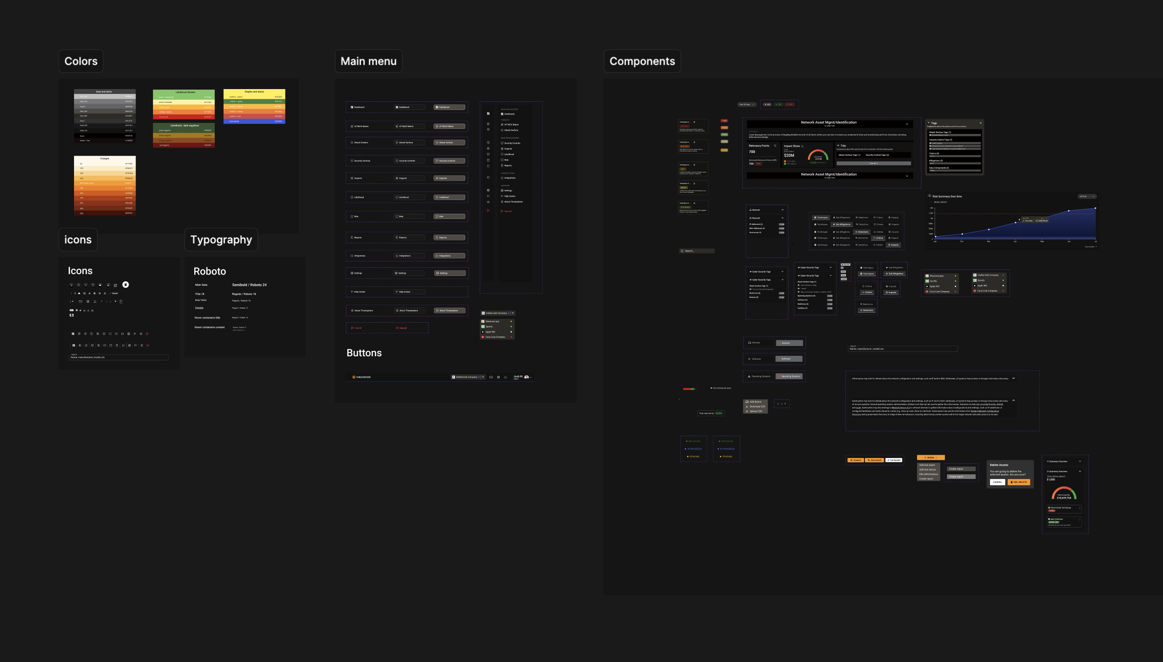
Established a reusable design system to ensure visual consistency in future modules.
This project taught me how UX design can directly influence sales performance and client perception. By transforming dense cybersecurity data into a clear, guided experience, we helped both technical and business audiences quickly grasp the platform’s value — turning complexity into clarity.
Design
Design System: