Improving Cross-Role Experiences Across a Multi-User Government Education Platform
Next Steps Idaho is a statewide education platform designed to help students prepare for life after high school while enabling educators, counselors, and administrators to guide and monitor student progress.
This case study focuses on improving cross-role experiences across a complex, multi-user government platform by reducing friction, increasing clarity, and aligning user journeys across different roles.
Next Steps Idaho supports multiple user roles, each with distinct goals and permissions:
- Students
- Teachers
- Counselors
- District Administrators
My Role:
UX/UI Designer
Responsibilities:
- UX research and synthesis
- Information architecture
- User flows and journey mapping
- Interaction design
- UI design and design system alignment
- Collaboration with product managers, developers, and stakeholders
- User stories
- QA
The Problem
As the platform scaled to support more users and features, several UX challenges emerged:
Inconsistent experiences across user roles
Confusion around shared data such as classes, bundles, assessments, and progress
High cognitive load during onboarding, especially for educators
Difficulty understanding how actions in one role impacted another role
Increased dependency on support and manual explanations
Because this was a government platform, any usability issue directly affected thousands of users across the state.
Goals
Improve clarity and consistency across roles
Reduce onboarding friction for educators and counselors
Align mental models between students and educators
Make system relationships easier to understand
Support scalability without increasing complexity
Research & Discovery
Methods
Stakeholder interviews
User interviews with students and educators
Review of existing user feedback and support issues
UX audits of current flows
Collaboration sessions with product and engineering
Key Insights
Educators did not always understand where student data originated
Similar concepts were labeled differently across roles
Some screens mixed too many responsibilities at once
Users relied on memory instead of system guidance
New users struggled most during the first session
Key UX Challenges Identified
Cross-role data dependencies were invisible to users
Navigation patterns were not consistent across roles
Onboarding did not adapt to user context
Empty states lacked guidance and next steps
System feedback was often delayed or unclear
UX Strategy
1. Cross-Role Alignment
I mapped how actions taken by one role affected others and used that to:
Align terminology
Standardize component behavior
Clarify cause-and-effect relationships
2. Progressive Disclosure
Instead of showing everything at once:
Information was revealed based on user context
Advanced options appeared only when needed
Cognitive load was reduced for first-time users
3. Clear System Feedback
Success and error states were redesigned
Verification and loading states were standardized
Visual feedback reduced uncertainty
Design Solutions
Home Dashboard Redesign
Personalized welcome state
Clear hierarchy of primary tasks
Separation between active work and resources
Visual indicators for progress and completion
Onboarding Improvements
Contextual onboarding based on user role
Clear explanation of next steps
Reduced number of decisions required upfront
Empty States
Action-oriented empty states
Clear calls to action
Educational microcopy explaining what to do next
Navigation & Information Architecture
Consistent navigation logic across roles
Improved labeling aligned with user language
Clear separation between exploration and action
Accessibility & Government Standards
Color contrast reviewed for accessibility compliance
Clear focus states and readable typography
Consistent interaction patterns to support usability for diverse users
Results & Impact
While the platform is still evolving, early outcomes included:
Improved clarity across student and educator experiences
Reduced confusion during onboarding flows
Better alignment between backend logic and frontend mental models
More confident task completion across roles
This work laid the foundation for future scalability while keeping the experience intuitive and human-centered.
What I Learned
Designing for government platforms requires balancing flexibility and consistency
Cross-role UX is as much about education as it is about interface design
Clear system feedback reduces support needs significantly
Collaboration with engineering early prevents UX debt
Design
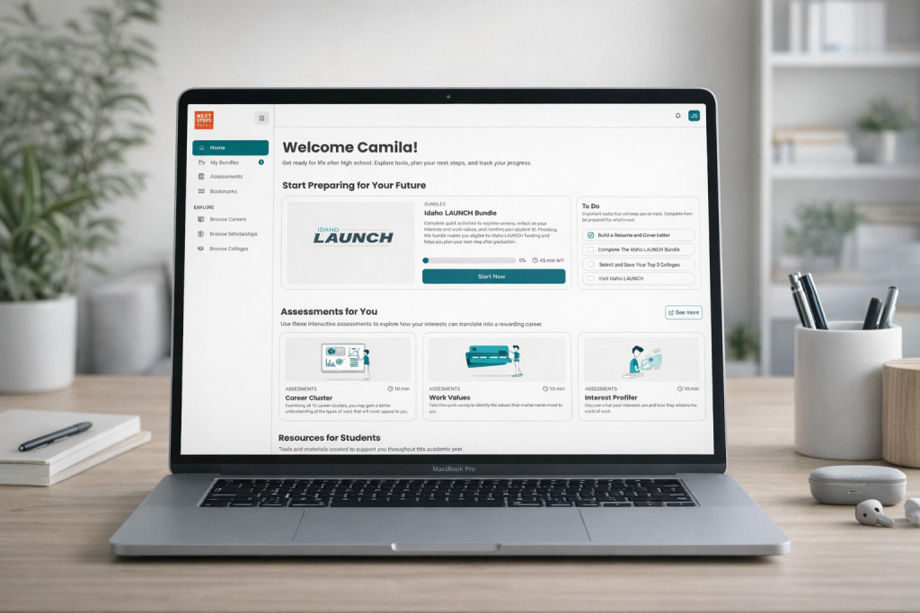
Student Dashboard:
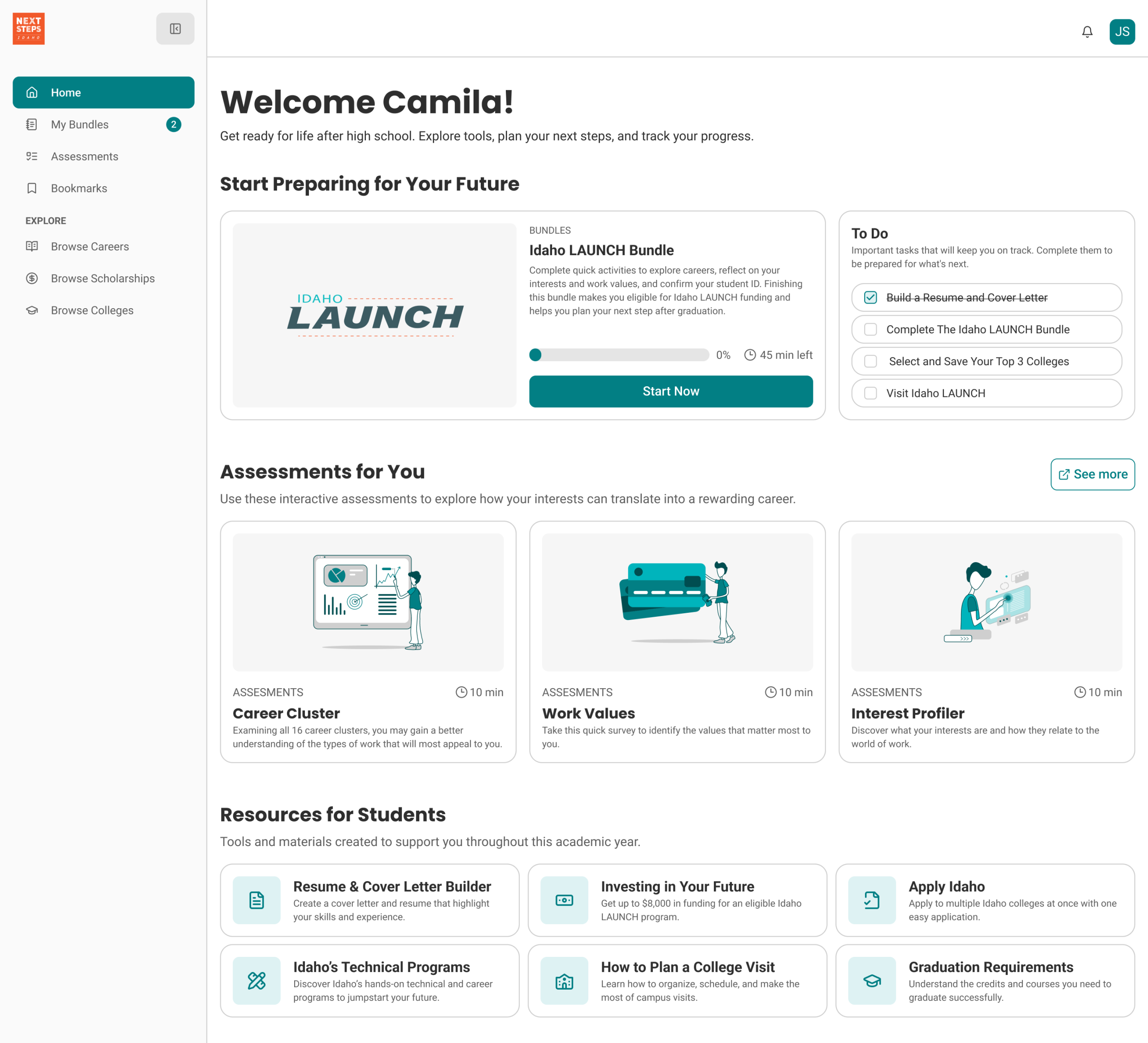
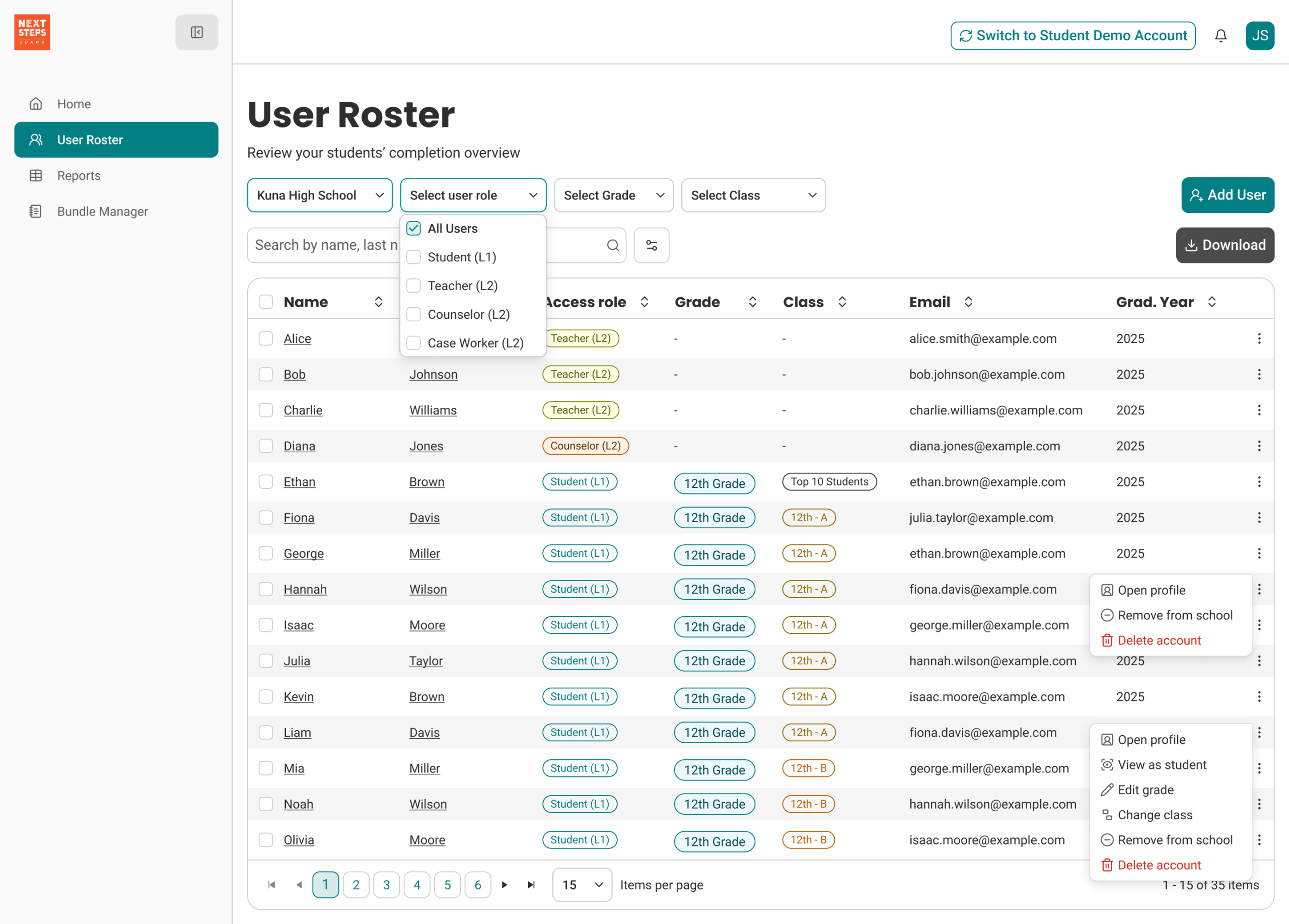
Previously, the platform did not include a side navigation. Instead, it relied on a shared bookmark system that was visible to all user types. For this project, we redesigned the navigation by separating the experience by user role, ensuring that each role sees a tailored interface.
For students, the new side navigation includes Home, My Bundles, Assessments, Bookmarks, and the three exploration directories. Through user interviews, we discovered that students often felt stressed about choosing a future career and experienced pressure from both family and educators.
To address this, we shifted the interface toward a more exploratory and guided experience. The Home page was redesigned with a To-Do–driven structure, allowing students to explore at their own pace without feeling overwhelmed, while still guiding them toward the core goals of the Idaho Launch program.
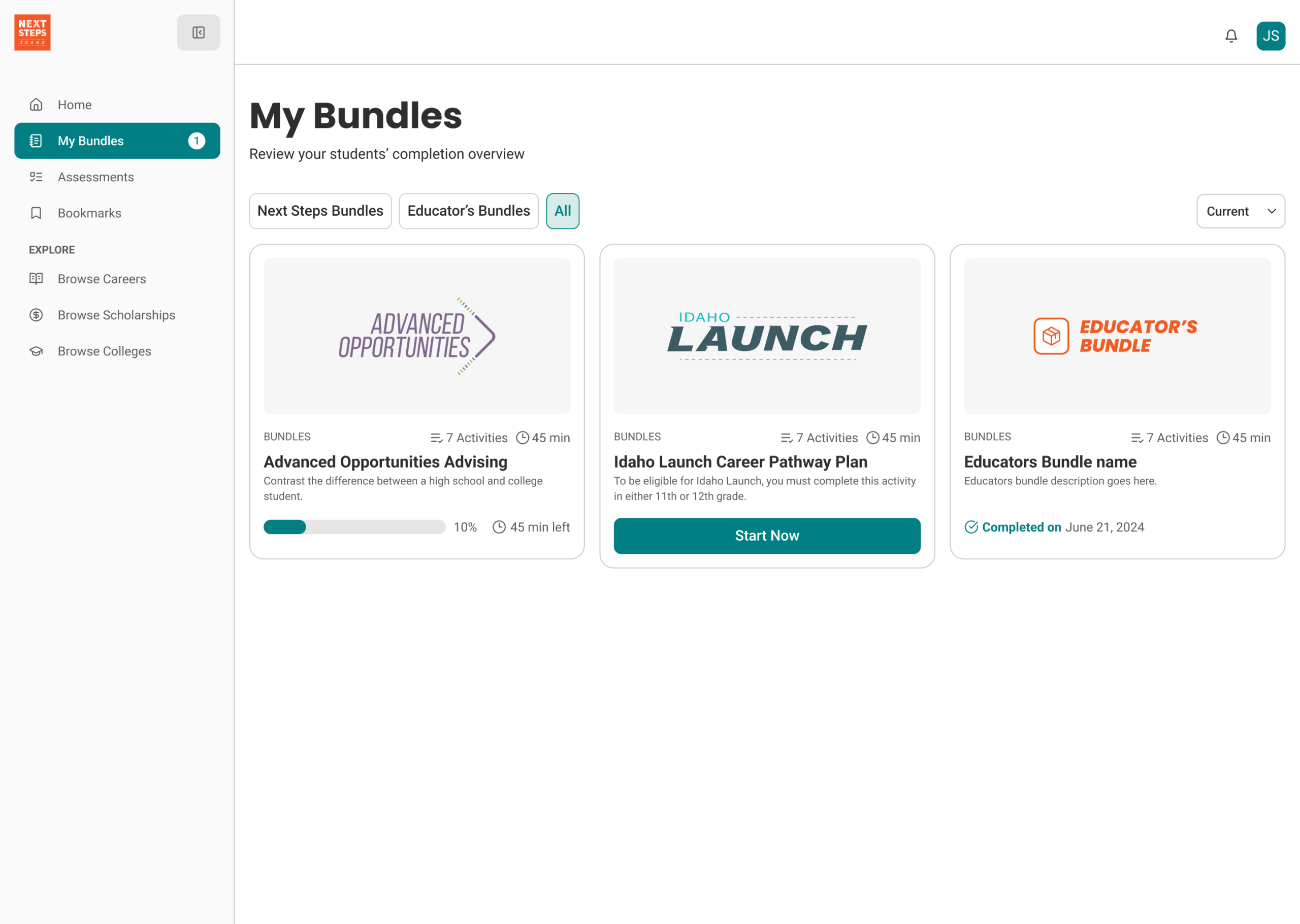
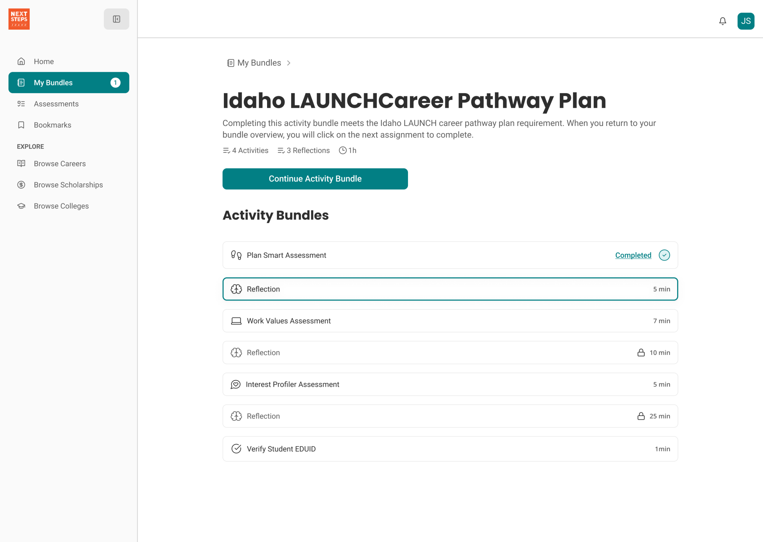
Educator Dashboard:
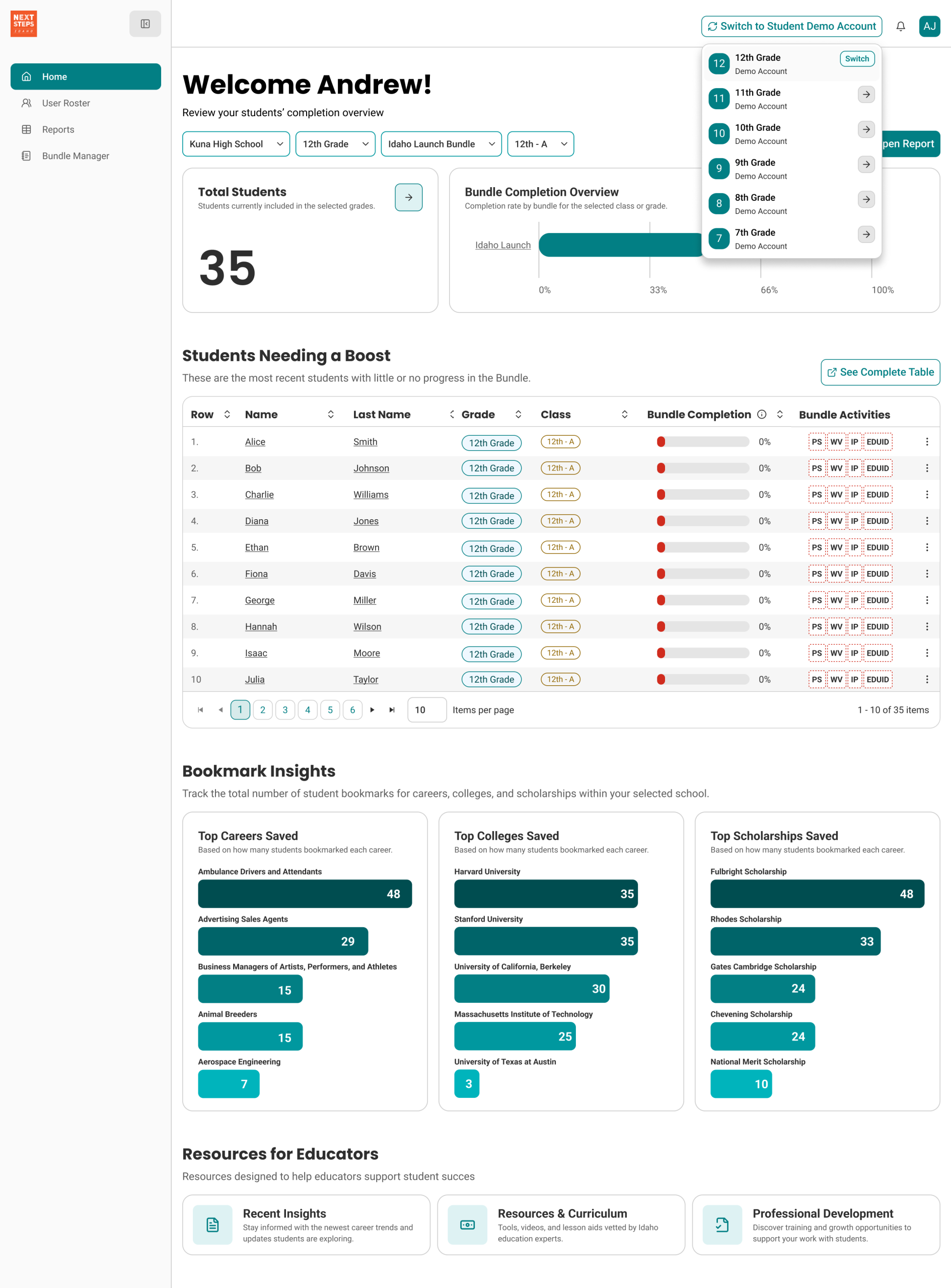
Previously, educators were presented with the same interface as students, which made the platform confusing and failed to deliver immediate value for their daily workflows. The lack of role differentiation limited educators’ ability to quickly understand student progress and take meaningful action.
To address this, we redesigned the educator dashboard to be purpose-driven and role-specific. We introduced an impersonation feature, allowing educators to view the platform from a student’s perspective and easily review individual progress and completion status.
To support classroom onboarding, we added a student demo account, enabling educators to walk through the platform in live classroom settings without exposing real student data. Additionally, we introduced Educator Notes, a shared space where educators can document observations, add context, and collaborate by sharing insights about students across the platform.
Next Steps
1. Continue validating flows with usability testing
2. Expand analytics tracking to measure task success
3. Iterate on dashboards using behavioral data
4. Refine role-based personalization
5. Validate and monitor assumptions using heatmaps and session recordings (Hotjar).